

A metaphor is a figure of speech used to describe an object or action in comparison to something that is dissimilar but has something in common, often serving as a powerful metaphor for data. Here are a few examples:
- Living on the razor's edge
- Swimming with the sharks
- Climbing the corporate ladder
- Thinking outside the box
- That ship has sailed
- Weed the garden
Numerous metaphors are woven into the fabric of data science itself, such as "data warehouse," "data lake," and "data mining." Metaphors are essential to the way humans communicate and process ideas, especially in fields like data analytics. They enable us to more quickly and easily grasp and assimilate the unfamiliar by comparing it to what is familiar.
When people use metaphors to communicate, you may not even realize they're doing so; in fact, they may not even realize they're using metaphors. However, when composing a data science story, you should consciously look for opportunities to tap the power of data storytelling metaphors, especially when introducing new or complex ideas or concepts. In fact, your entire story may be a metaphor — in the form of a parable or fable — used to illustrate a point you are trying to convey. Remember that metaphors link the unknown to the familiar; your audience is more likely to feel a connection with a story that's familiar to them.
What is a Metaphor and Why is it Important in Storytelling?

A metaphor is a powerful tool that helps us understand complex ideas by comparing two unrelated things, and it's a common technique in data analysis. For example, saying 'life is a journey' is a metaphor. It helps us understand life by comparing it to a journey, which is something we can relate to.
Metaphors are important in storytelling. They engage the audience by linking new information to their existing knowledge. They simplify complex ideas, making it easier for the audience to grasp and retain key insights.
By using metaphors, storytellers can explain complex ideas in a way that's easy to understand. For instance, saying 'the company is a ship' can help explain the company's structure and goals in a simple way. This makes it easier for the audience to understand and remember the information.
In short, metaphors help us understand complex ideas by comparing them to things we already know. They're a powerful tool in storytelling, making it easier for the audience to grasp and retain key insights.
Understanding the Concept of a Metaphor
As previously described, metaphors help us explain complex ideas by linking them to familiar things. When we use a metaphor, we're saying one thing is something else to make it easier to understand. Metaphors are a powerful tool that helps us create creative comparisons, making abstract ideas more relatable to our audience.
Let's look at an example. Instead of saying 'The company's profits increased,' we could say 'The company's profits soared like an eagle.' This metaphor not only shows growth but also adds a sense of grandeur and power. This kind of symbolic meaning can greatly impact how our audience understands the information.
Metaphors also add depth to our story. They provide layers of meaning that straightforward explanations might lack. They allow us to tap into our audience's prior knowledge and experiences, making our story more relatable.
The Role of Metaphors in Engaging Data Stories
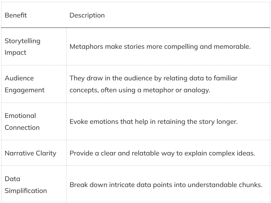
Metaphors make data storytelling engaging and memorable. This enhances storytelling impact and boosts audience engagement.
Metaphors create an emotional connection with the audience, helping them remember the data better. They bring narrative clarity, making it easier to convey your message.
Using metaphors in data storytelling has several benefits:
How Metaphors Can Help Simplify Complex Data
Metaphors help us tell stories with data. They connect confusing numbers to our audience's understanding. This process makes it easier for people to process and understand the data.
Think of data like a new city. You need a map to navigate it. A good metaphor is like a map, guiding your audience through complex data. This not only makes the information easier to understand but also keeps the audience engaged.
For example, saying a company's growth is like a 'snowball rolling down a hill' quickly conveys the idea of growing speed and momentum. This metaphor simplifies complex growth metrics, making it easier for the audience to understand and remember.
How to Use Visual Metaphors in Data Visualization?
Visual metaphors in data visualization help communicate complex information in a simple, engaging way.
To use them effectively, choose a metaphor that fits your data and the story you want to tell.
Design your visualization to clearly represent the metaphor.
This ensures your audience quickly understands the insights.
Choosing the Right Visual Metaphor
When you pick the right visual metaphor, you can turn complex data into clear insights. Start by getting inspiration from the story behind your data. Think about how you can use visual storytelling to bring numbers and facts to life. Use symbols to make abstract ideas concrete.
Consider who your audience is. What symbols or images will they relate to? A well-chosen metaphor speaks directly to their experiences and knowledge. For example, if your audience is familiar with technology, a network metaphor for complex systems can help them understand quickly.
A good visual metaphor should make things simpler, not more complicated. It should reduce the mental effort your audience needs to understand the data. Finally, test your metaphors. Get feedback to make sure they aren't only visually appealing but also effective in conveying the insights you want to share.
Designing Effective Data Visualizations with Metaphors
To create effective data visualizations, identify a visual concept that clearly represents the data's key insights. Think about how a creative visualization can transform abstract numbers into relatable images.
For instance, if you're presenting growth, you might use a tree or plant metaphor, showing branches and leaves expanding over time.
A good metaphor is essential. If your audience is familiar with sports, using a metaphor related to a game or race can make complex data more understandable. This is because people can relate to concepts they already know.
Once you have your metaphor, integrate it into your visual storytelling. Use colors, shapes, and layouts that enhance the metaphor and clarify the data's narrative.
For example, illustrating market share using pie charts that resemble slices of a pie can make the information more relatable and memorable.
Choose metaphors that align with your audience's experiences for easier data interpretation. This helps people understand the data better.
Why Use Metaphors and Analogies in Big Data Presentations?
Using analogies and metaphors in big data presentations helps make complex information more relatable and easier to understand for your audience. This is because they connect data to familiar concepts, which engages stakeholders and influences their decisions more effectively.
To get the most out of metaphors and analogies, evaluate and refine them to ensure they're clear and impactful. This will enhance your overall presentation and help you achieve your goals.
Benefits of Using Metaphors in Presentations
- Metaphors turn abstract data into relatable concepts, making your presentation more engaging and interactive.
- They add visual appeal, turning data into vivid imagery that grabs attention. This visual element makes your slides more attractive and aids in memory retention.
- Metaphors also help build a connection with your audience. By linking complex data to everyday experiences, you make the information more accessible and relatable.
- This connection fosters a deeper understanding and keeps your audience invested in your story. When combined with storytelling, metaphors strengthen your arguments. They frame your data in a way that highlights its relevance and importance, making it easier to convince stakeholders and drive decision-making.
- Metaphors also evoke emotions, making your story more memorable and impactful. Emotions can motivate your audience to act on the insights you're presenting, leading to better outcomes.
- Using metaphors in your presentations is a strategic approach to make your data resonate. It's not just about making your presentation more engaging; it's about driving results.
How Metaphors Make Data More Relatable to Your Audience

When you use metaphors, you tell a more effective story, which engages the audience and captures their attention. For example, comparing data growth to a tree's growth provides a clear visual representation, making it easier for the audience to understand intricate details.
Metaphors simplify data interpretation and boost understanding by translating abstract numbers and trends into concepts the audience already knows. This helps the audience remember the information better, as stories anchored in familiar metaphors stick longer in memory.
By turning dry statistics into engaging stories, you make your data presentations informative and memorable. Visual metaphors, like depicting market trends as a roller coaster, create vivid images that keep the audience engaged and aid in quick comprehension.
The Power of Metaphors in Influencing Stakeholder Decisions
Metaphors hold significant power in big data presentations.
Metaphors help you influence decision-making by aligning your data narrative with strategic objectives. This enhances stakeholder buy-in and drives better decision outcomes.
Metaphors are crucial for several reasons:
- Stakeholder Influence: Metaphors make data relatable, fostering stakeholder engagement and making your arguments more compelling.
- Impactful Storytelling: A well-chosen metaphor transforms abstract data into vivid stories, helping stakeholders grasp the significance of your message.
- Data Interpretation: Metaphors simplify data interpretation, allowing stakeholders to understand and act on insights without getting bogged down by technical jargon.
- Strategic Alignment: By framing your data in a narrative that aligns with business goals, you increase the likelihood of stakeholder buy-in and informed decision-making.
Evaluating the Effectiveness of Your Metaphors
To make your big data presentations resonate with your audience, ensure your metaphors are effective. Start by analyzing your metaphors to see if they clarify the data. This helps you determine if your audience relates to the analogies used.
To evaluate the effectiveness of your metaphors, use the following table:
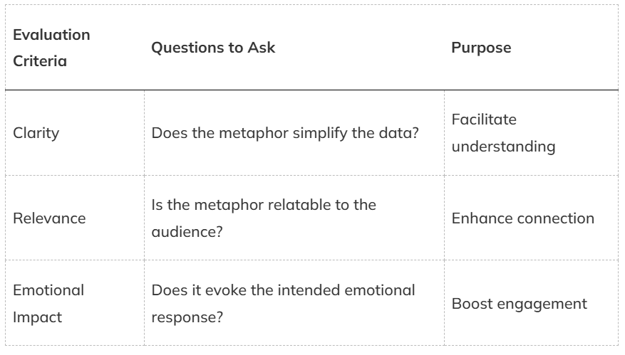
It's vital to analyze how well your metaphors align with the audience's experiences and knowledge. If a metaphor falls flat, it might confuse rather than clarify.
To measure the effectiveness of your metaphors, gauge how well they align with the audience's experiences and knowledge. Collect feedback to see if your audience retains and recalls the information better with the metaphors. By using these evaluation criteria, you can refine your approach and confirm your data stories are both engaging and
Refining Metaphors for Clarity and Impact
- Make it clear: Your metaphors should create comparisons that break down complex data into understandable terms. This clarity helps your audience grasp key points quickly. Your audience will understand your data better if your metaphors are relatable.
- Check for relevance: Ensure your metaphor aligns with your audience's experiences and knowledge. The stronger the connection, the more effective your metaphor will be. A good metaphor finds a balance between simplicity and accuracy.
- Simplify without oversimplifying: Strike a balance between making the data understandable and maintaining its integrity. Oversimplified metaphors can lead to misunderstandings. Test and refine your metaphors to ensure they deliver the intended message.
- Refine for impact: Constantly refine and test your metaphors to guarantee they deliver the intended message. An effective metaphor can substantially enhance your storytelling impact.
Other Types of Comparisons
You probably know about other figures of speech that involve comparisons, including the following:
Simile: A comparison between two objects or actions typically introduced with a word such as "like," "as," or "than." For example, "quiet as a mouse" or "more fun than a barrel of monkeys."
Analogy: An extended comparison of two similar but distinct objects or actions for the purpose of showing that the two are similar in more ways than one. (Some people think of "analogy" as a comparison and "simile" and "metaphor" as two ways to express that comparison.)
Allegory: A symbolic, fictional story, poem, or picture that conveys a broader message or lesson about life. For example, the novel Animal Farm, by George Orwell, serves as a satire of totalitarian governance.
Tip: Don't get caught up in the differences between metaphor, simile, analogy, and allegory. In storytelling, think in terms of making comparisons and connecting the unfamiliar to the familiar.
Case in Point
Imagine your data science team is working for a chain of movie theaters. Whenever a new release is available, management wants to know how many screens to show it on in each theater to maximize revenue. Showing the movie on too many screens leaves a lot of empty seats. Showing the moving on too few screens fails to capitalize fully on potential ticket sales.
Your team decides to develop a predictive analytics algorithm to calculate the number of screens on which to show the new release. Your team gathers structured and unstructured data. The structured data shows that people are watching the trailer on numerous websites. The unstructured data indicates high volumes of "mentions" about the movie on Twitter, Facebook, and other social sites.
When your data science team presents its findings to the client, it has two options. The first option is to present the data in language that's familiar to the data science team; for example, "Our analyses of both structured and unstructured data suggest a broad interest in the new release."
The other option is to speak in a language that's familiar among movie theater managers and harnesses the power of metaphors. For example, you may say something along the lines of, “We are picking up a lot of friendly chatter on social media, and traffic on sites that are showing the trailer is through the roof. You are definitely looking at a potential blockbuster.”
Through the use of more descriptive language, including metaphors, you convey the information and insight in a way that's easy for theater managers to understand. They immediately know not only the value of the data but also the sources — websites and social media venues. Instead of asking you to define "structured data" and "unstructured data," they'll ask meaningful questions, such as, "How accurate is the level of friendly chatter in predicting ticket sales?"
Your team may use other metaphors, as well, such as describing tickets for the show as hot tickets or explaining that a few weeks after the initial release of the movie, theaters could expect to see interest in the movie cool off. These metaphors make the story more interesting and fun, which keeps your audience engaged and helps them extract meaning from the data.
Metaphors are great for breaking down language barriers that stand between you and your audience, especially when you have complex concepts or ideas to convey. When you're working with colleagues on your data science team, you naturally use terminology that's familiar with team members. Don't assume that same language is understandable or interesting to others.
Metaphors not only make your story sound more interesting, but they also lower the bar to participation. The more your audience engages, the more likely they are grasp the meaning and significance of the data and the conclusions you've drawn from it.
Conclusion
Data storytelling is like building a bridge. It connects the complex world of data to the real world we live in. Without this bridge, data remains abstract and hard to understand.
Think of metaphors as the bricks that build this bridge. They turn confusing numbers into relatable ideas, making data more accessible. This is because metaphors create a mental image that's easy to grasp.
The beauty of metaphors lies in their ability to simplify complex data without losing its essence. This is crucial because complex data can be overwhelming.
By using metaphors, you can break down complex data into manageable chunks, making it easier to understand and communicate.
Frequently Asked Questions
How can I effectively use metaphors in data storytelling?
To use metaphors in data storytelling, follow these steps:
1. Understand the main message you want to share. 2. Find a simple metaphor that matches this message. 3. Make sure your audience can easily understand the metaphor.
For example, if you talk about complexity, you can use a spiderweb to show how data points connect. This helps your audience picture the idea better.
How do I choose metaphors and analogies that resonate with my audience?
To choose examples your audience understands, think about their background and experiences. For example, if you talk to a competitive sales team, you can use sports metaphors. Use common experiences that everyone knows.
Can you share some common mistakes to avoid when using visual metaphors in data storytelling?
Common mistakes include choosing metaphors that are too complex, not relevant to the data, or overly cliché.
It's also important not to mix multiple metaphors in one presentation, as it can confuse your audience. Always test your metaphor with a small audience first to ensure it’s great it’s clearly understood.
How can visual metaphors help convey data more effectively?
Visual metaphors help convey data by turning abstract concepts into familiar images, making ideas easier to grasp. For example, using a graph as a visual metaphor can illustrate trends and comparisons effectively, helping the audience quickly understand what the data represents.
Visual metaphors help show data by turning hard ideas into easy pictures. This makes ideas easier to understand. For example, using a graph can show trends and comparisons.

This is my weekly newsletter that I call The Deep End because I want to go deeper than results you’ll see from searches or LLMs. Each week I’ll go deep to explain a topic that’s relevant to people who work with technology. I’ll be posting about artificial intelligence, data science, and ethics.
This newsletter is 100% human written 💪 (* aside from a quick run through grammar and spell check).
More sources
- https://www.linkedin.com/advice/0/how-can-you-effectively-use-metaphors-analogies-r8foe
- https://strategy-compass.com/en/storytelling-in-presentations/
- https://growthtribe.io/blog/data-storytelling-the-power-of-analogies
- https://www.incite-global.com/2023/10/26/visual-metaphors-a-secret-ingredient-to-impactful-storytelling/
- https://www.researchgate.net/publication/377782611_Metaphors_and_%27Tacit%27_Data_The_Role_of_Metaphors_in_Data_and_Physical_Data_Representations
- https://dl.acm.org/doi/10.1145/3623509.3633355
- https://www.integrate.io/blog/structured-vs-unstructured-data-key-differences/
- https://www.ibm.com/think/topics/structured-vs-unstructured-data